Senior UX writer with 10 years of experience turning technical and legal language into clear product flows, support content, and scalable standards.

Writing for the 10-foot interface. The line that became the campaign.
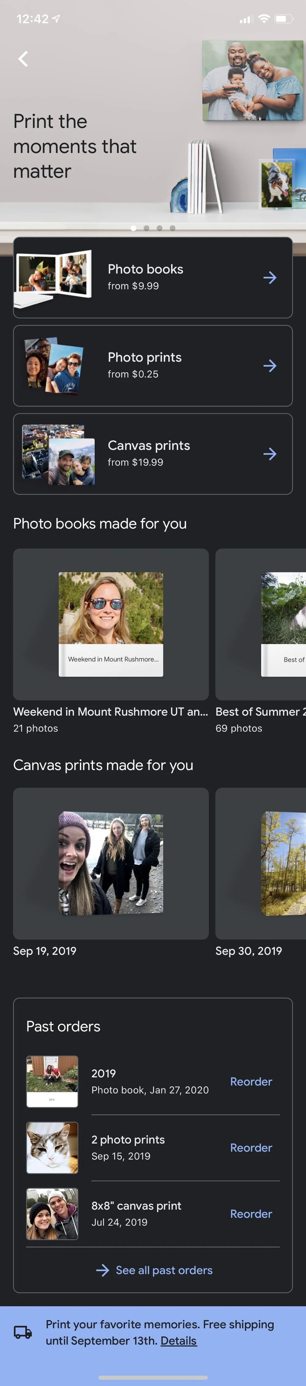
Sharing, prints, and the strings a billion people never notice.
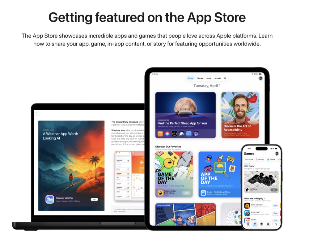
Naming and positioning a new path to App Store featuring.
The Apple TV app wasn't another streaming service. It was a new way to start watching, and I had seconds of copy to make that clear.

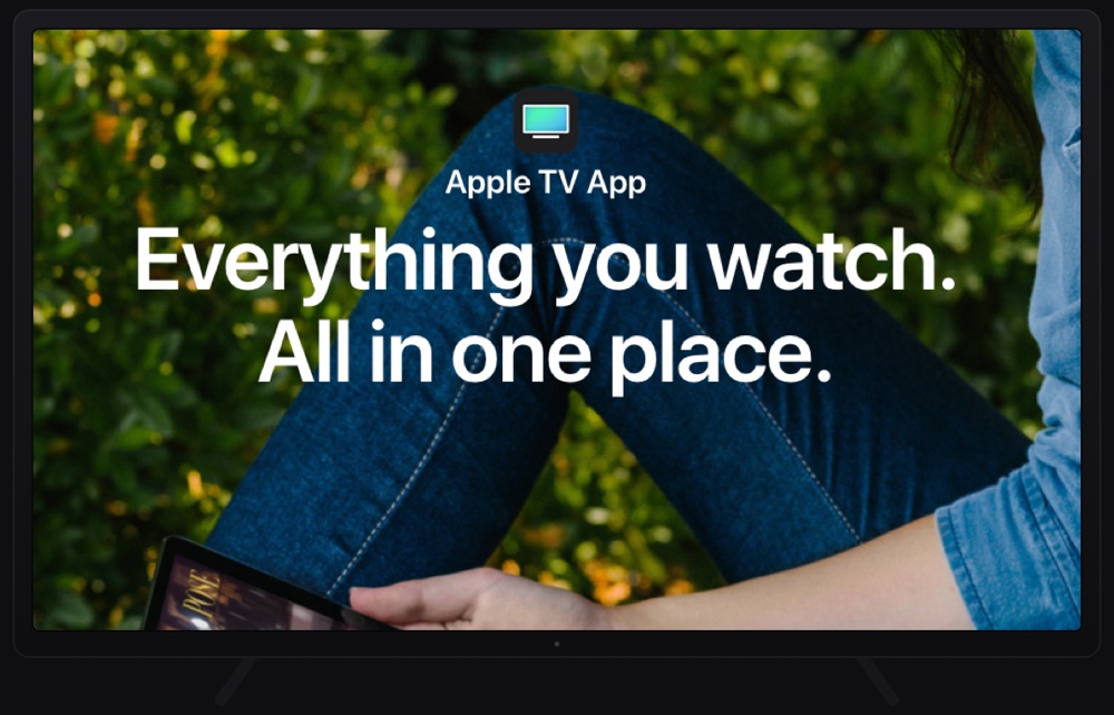
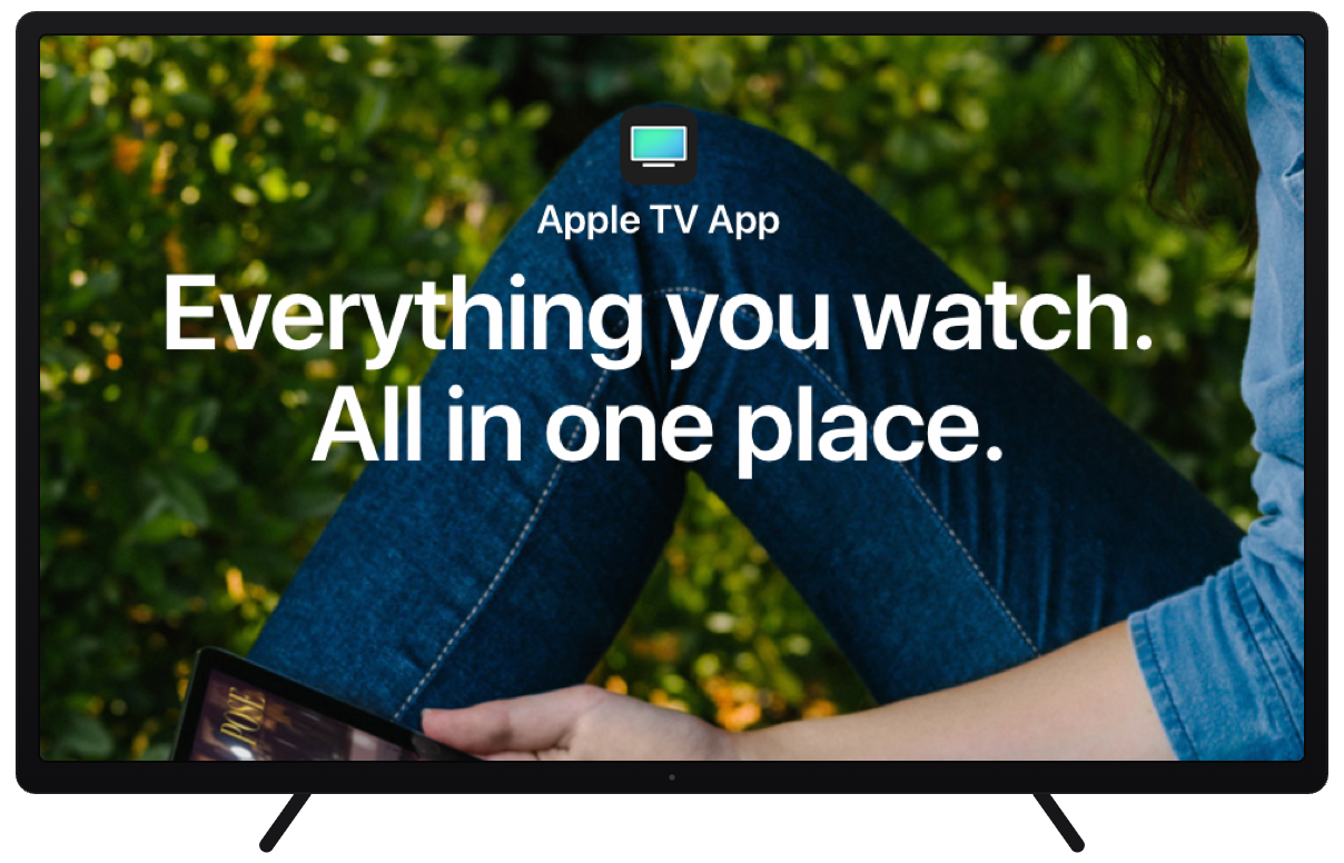
“Everything you watch. All in one place.” Eight words to make an unfamiliar product legible. No provider names, no explaining what aggregation means. Apple adopted it for advertising.

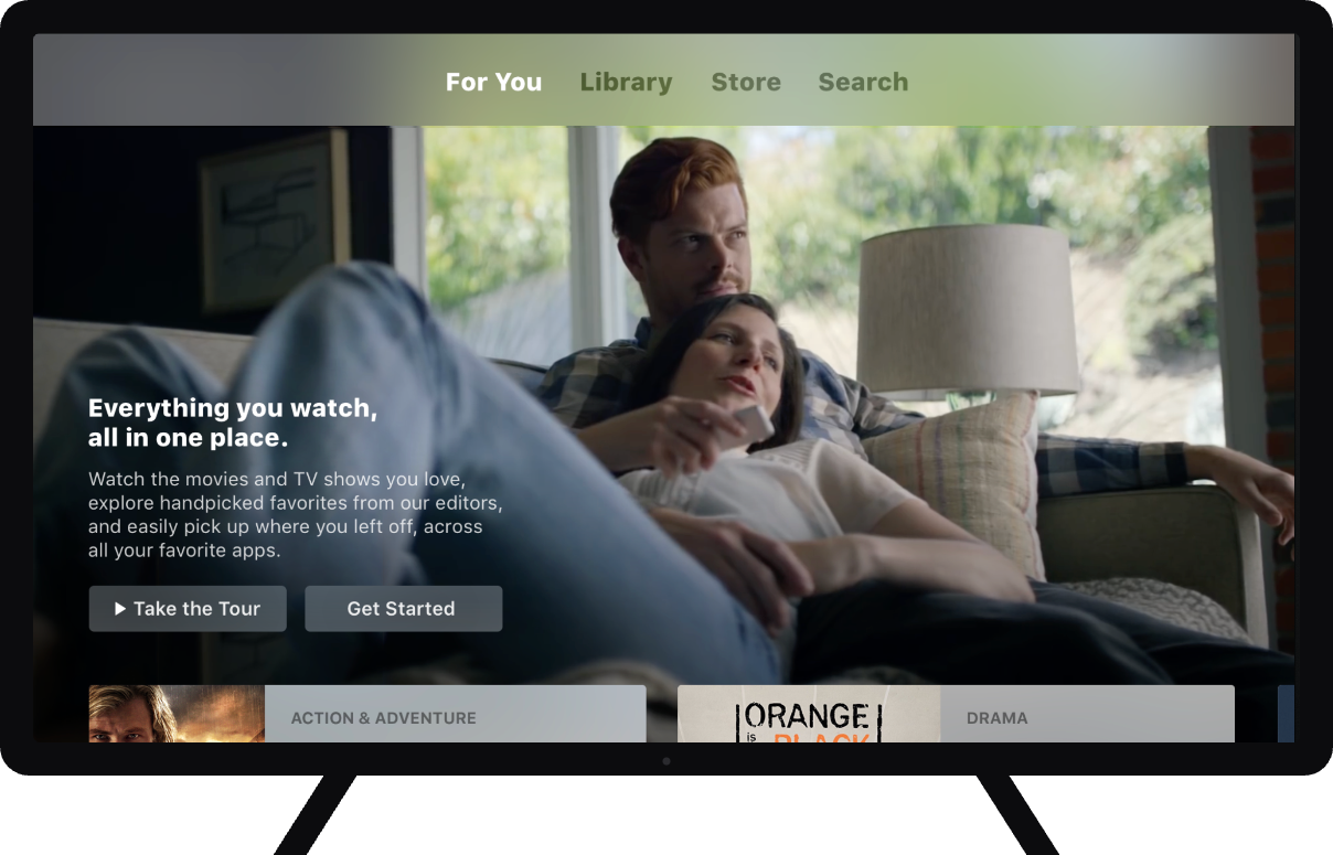
Where the line shipped first. Each phrase of body copy names a real behavior, and the two buttons split the audience. A tour for the cautious, a start for the ready.
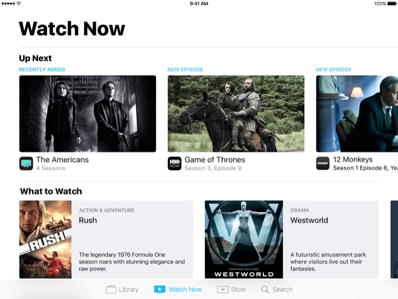
The Apple TV app lets you add and watch movies and TV shows from any supported app. All in one place on all your devices. And with Up Next, you’ll always know where you left off, so you never miss a thing.
Watch the movies and TV shows you love, explore handpicked favorites from our editors, and easily pick up where you left off, across all your favorite apps.
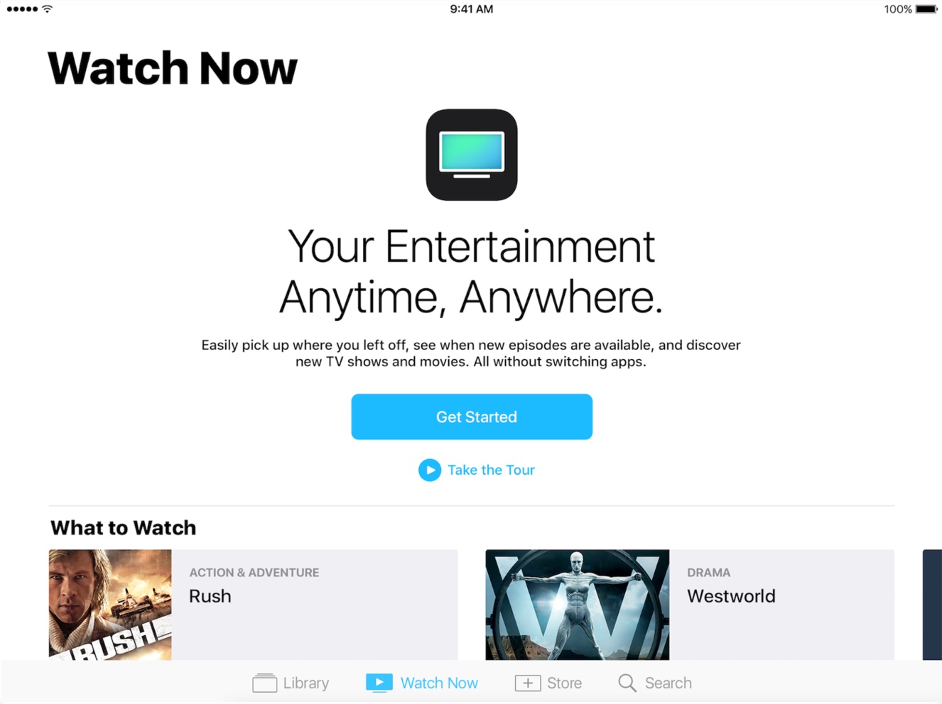
The earlier pass positions by category and mechanics. The shipped version positions around the person. Same promise, different subject.

An empty state has nothing to show, so the words do all the selling. I led with the benefit and wrote the button to start setup. A dead end turned into a beginning.


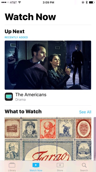
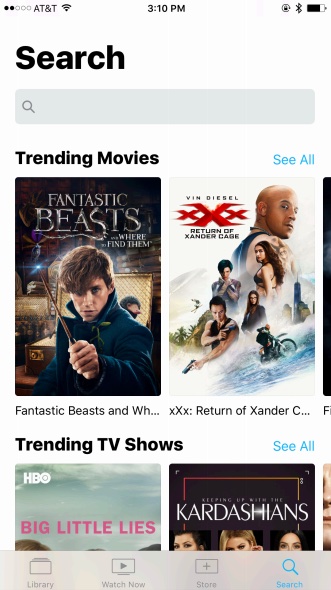
I named the sections to read instantly across iPhone, iPad, and TV. Up Next held everything you'd started, regardless of service. What to Watch recommended across the whole ecosystem.

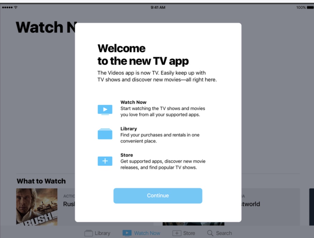
Upgraders didn't choose a new app. An update turned Videos into TV. One modal to orient them and answer the only question that mattered. Where did my stuff go?


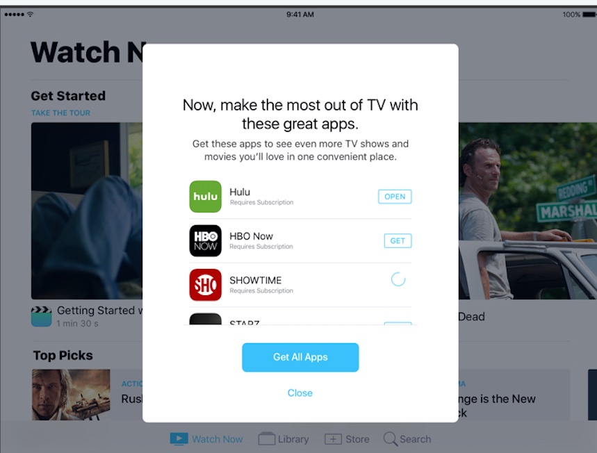
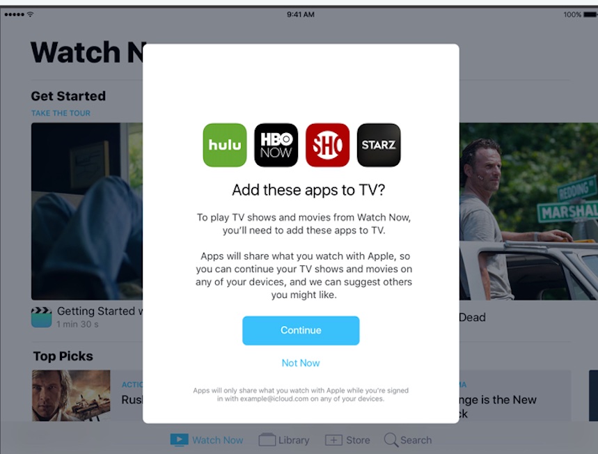
Setup asked for access before people had felt the payoff, so the copy did trust work. It framed the ask around the benefit and kept the privacy disclosure plain.


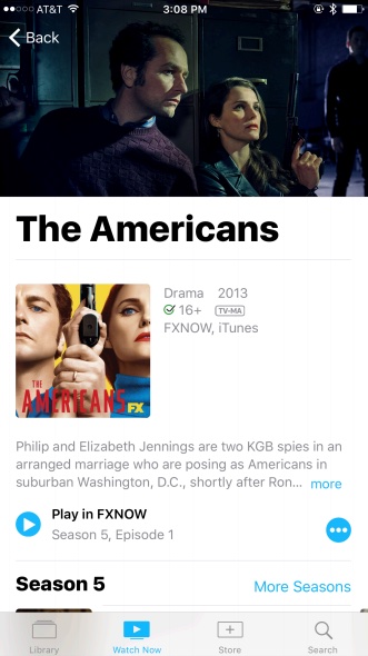
An aggregator is only useful if every action tells you where you'll land. “Play in FXNOW,” “Open in iTunes,” “Remove From Up Next.” Precise labels let people move with confidence.

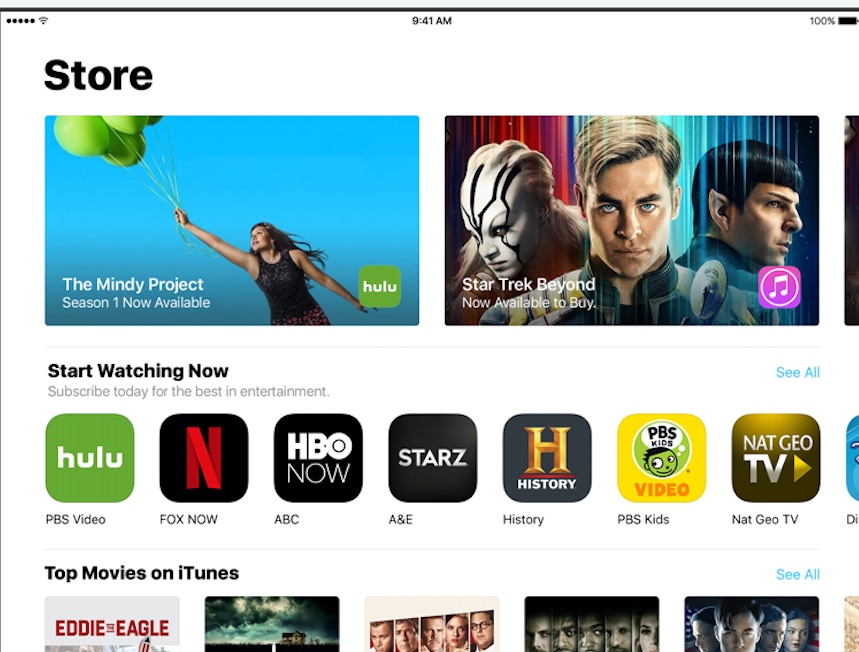
The Store sat inside a utility, so the copy sold without turning the app into an ad. “Season 1 Now Available” for streaming, “Now Available to Buy” for purchase.
Beyond the core app, I wrote product copy and collaborated on UX across the tvOS platform.
Clear, direct strings for video settings. The most information without forcing another navigation step.
I wrote the onboarding copy for syncing Home Screens across Apple TVs during new setup and upgrade flows.
Opt-in copy for storing logins in iCloud and using them across devices. Effortless, not technical.
I wrote the copy for authenticating with cable and TV providers.
Google Photos helps billions of people store, organize, share, and revisit their memories across devices. I wrote UX content across Android, iOS, and web for print products, sharing, storage, and feedback.
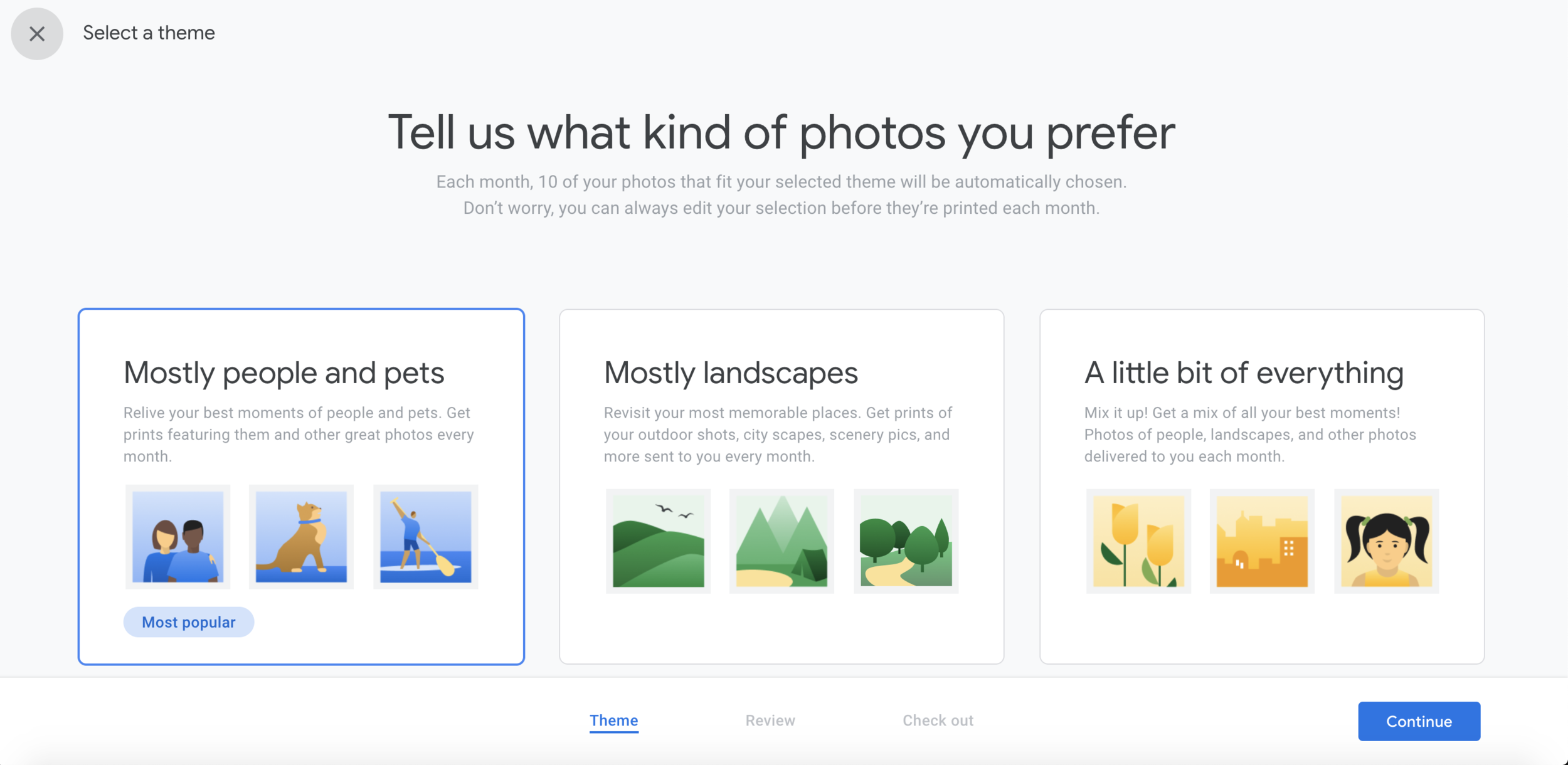
An example screen from the Google Hub photo setup flow. It let people choose the kinds of photos they wanted to see, so their display filled with the moments that mattered to them rather than everything at once.
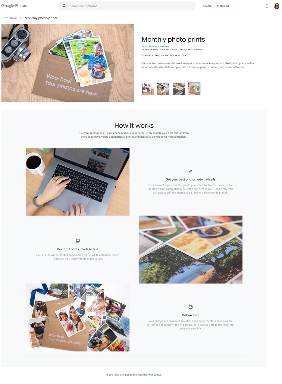
A recurring purchase living inside a free app people trust with their memories. The copy led with the value. Your best photos, printed and delivered every month. Pricing, materials, and terms stayed up front.


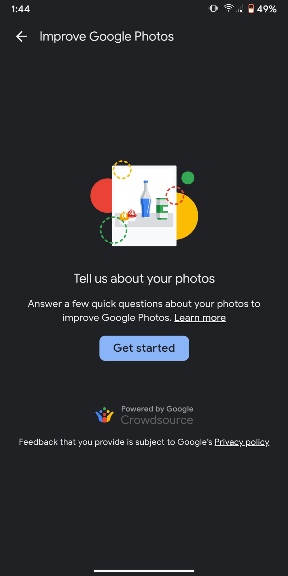
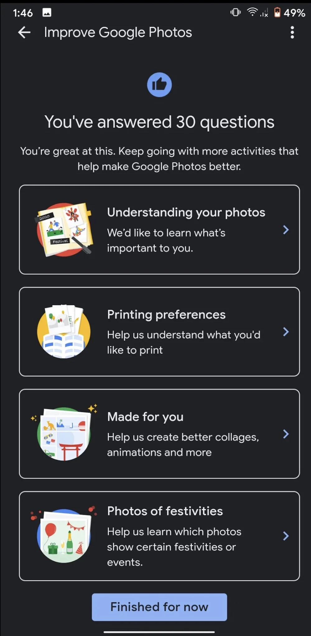
Prompts that explained why Google was asking and how answers would improve the product. Light, optional, and quick, so contributing never felt like a chore.


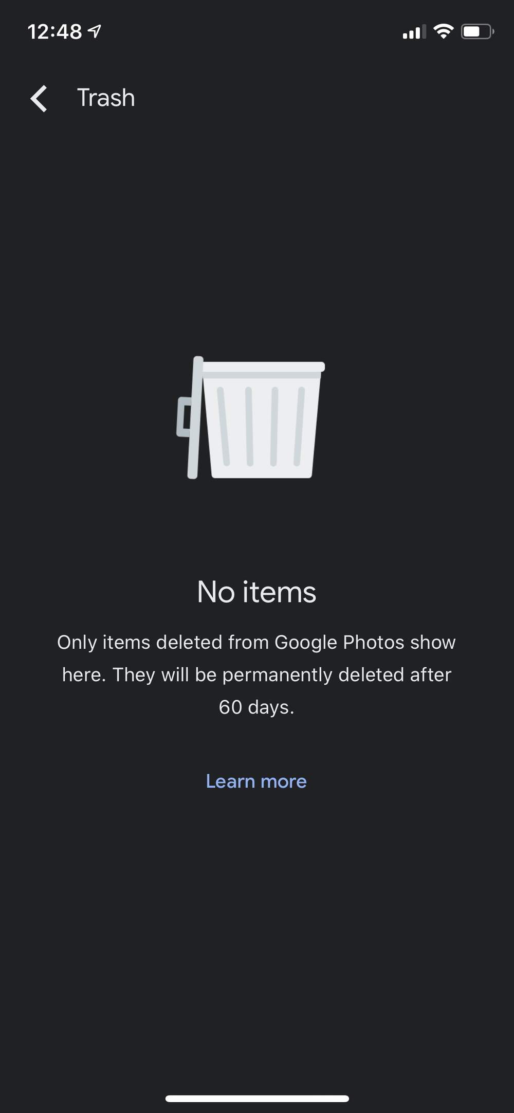
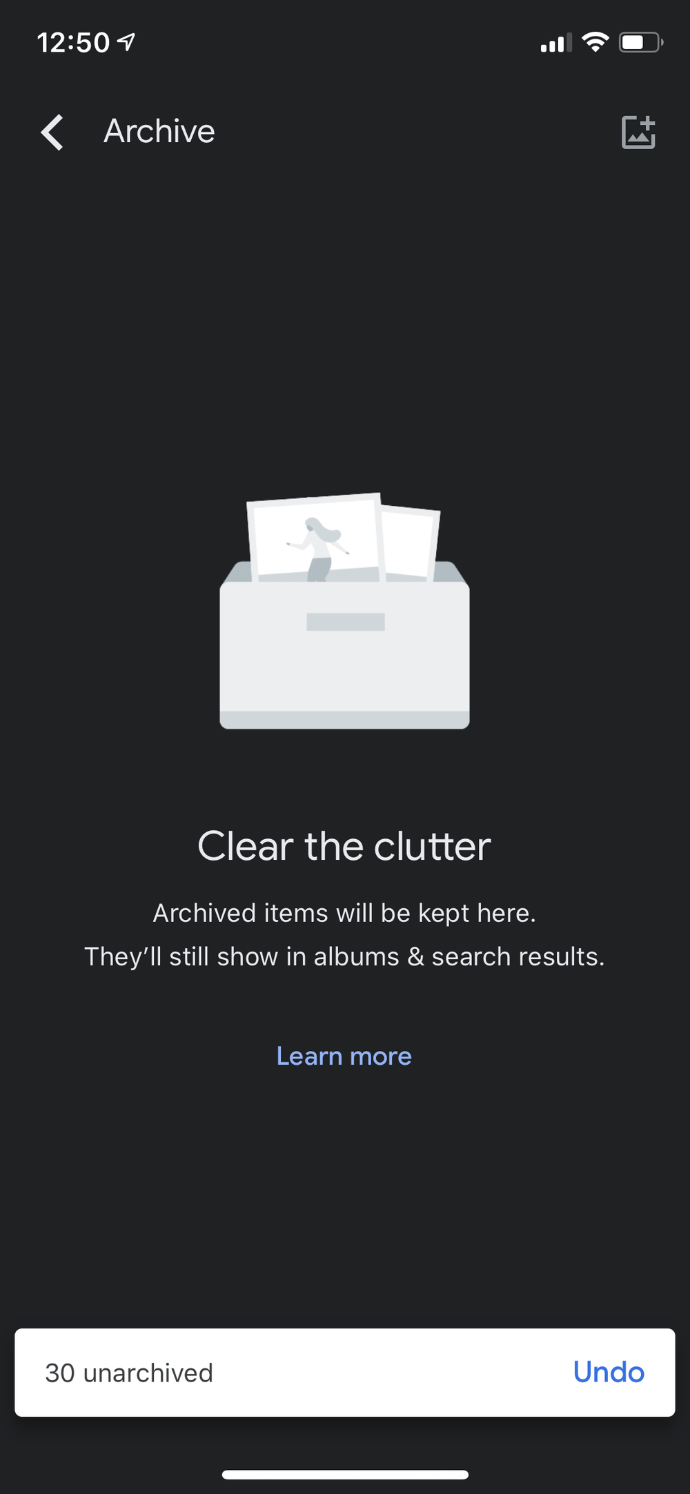
Trash explained the 60-day window before anything is permanent. Archive clarified that hidden items still live in albums and search. Both told people where their content went.

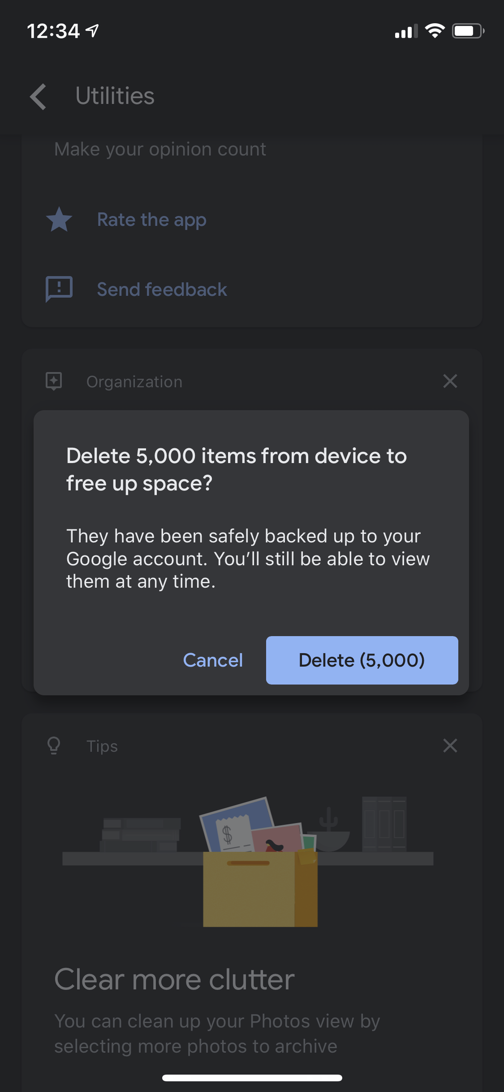
Freeing up space makes people nervous, so the copy did the reassurance in the same breath as the ask. Removed from this device only, safely backed up, still viewable any time.
TestFlight lets developers invite people to try apps before they're released. For many testers it's their first beta. They don't know what a build is, or why the app behaves differently than one from the App Store. I wrote the words that answered that.

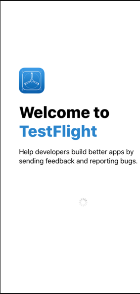
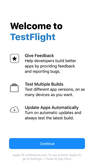
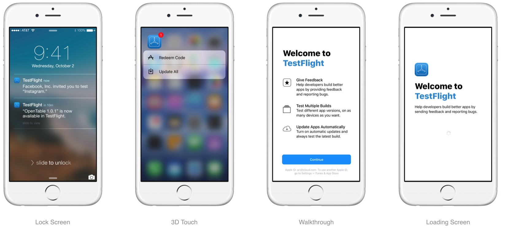
Most testers' first look at TestFlight. I led with the tester's contribution. What the product is, what your role is, why it helps developers, all in one sentence that set the tone for every screen after it.

I skipped “beta testing,” “builds,” and “pre-release software” and introduced one concept at a time through what the tester can do. Give feedback, test different versions, stay up to date.

Invitations, notifications, the loading screen. Identical language across every entry point. One name per thing, because a tester who sees two names assumes two things.

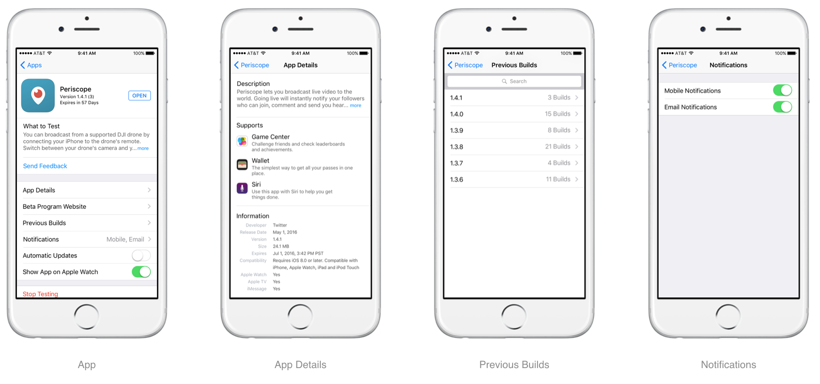
The small copy that does TestFlight's real work. What am I testing, what changed, how do I send feedback, how do I stop. Each screen answers its user's immediate question first.
I made app names, versions, and expiration details easy to scan.
I kept actions like “Send Feedback,” “Previous Builds,” and “Automatic Updates” direct and recognizable.
I wrote notification and update settings to feel predictable, not technical.
I made “Stop Testing” clear, visible, and final enough that users understood the consequence.
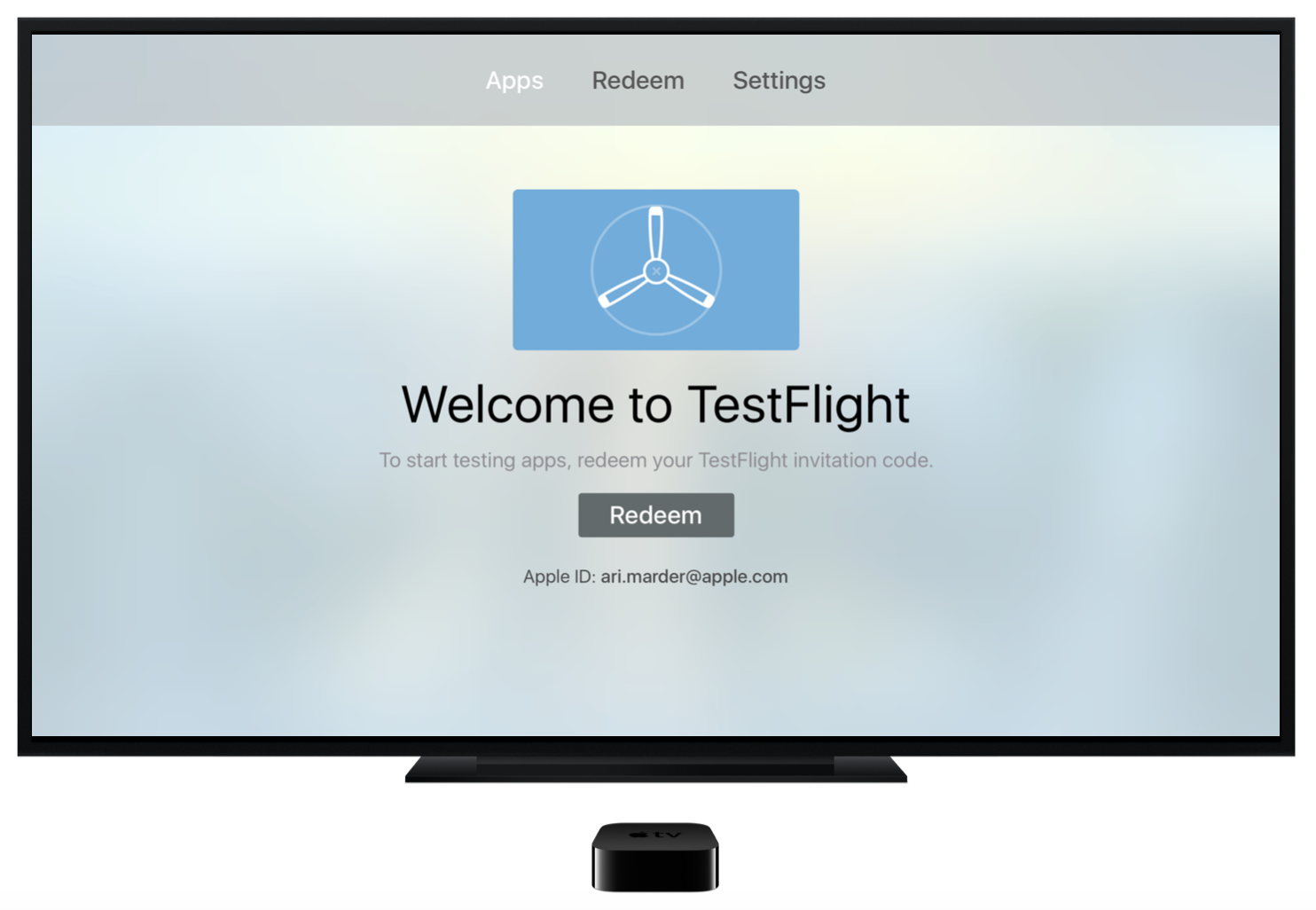
On tvOS I worked under a different set of constraints. The interface is read from across the room, navigation depends on focus states, and every word costs more. I trimmed every string to match.

The same welcome idea from iOS, trimmed to survive the 10-foot reading distance, so the product sounded the same no matter the screen size.

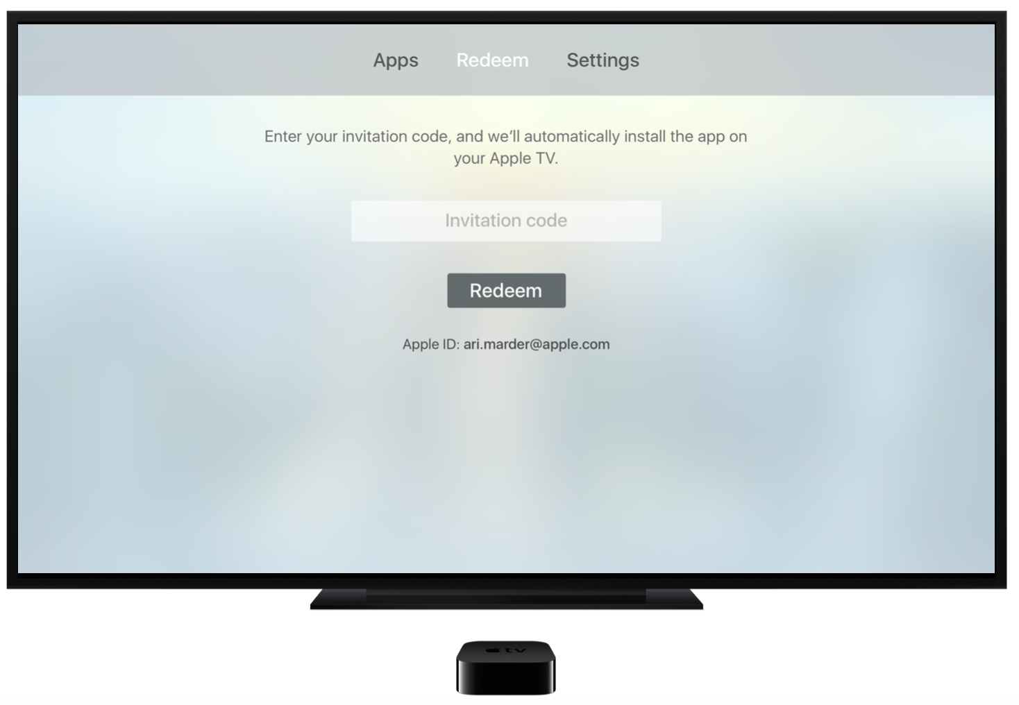
One instruction and one promise. Enter your code, and we'll install the app. With a remote as the only input, nobody should wonder what to type or what happens next.

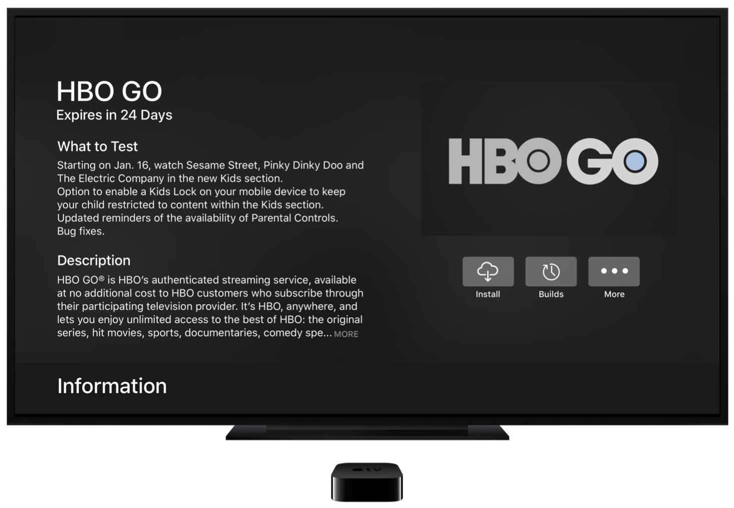
“What to Test” notes, expiration dates, and actions like Install kept scannable from the couch. A tester who can't tell what's new can't test what matters.

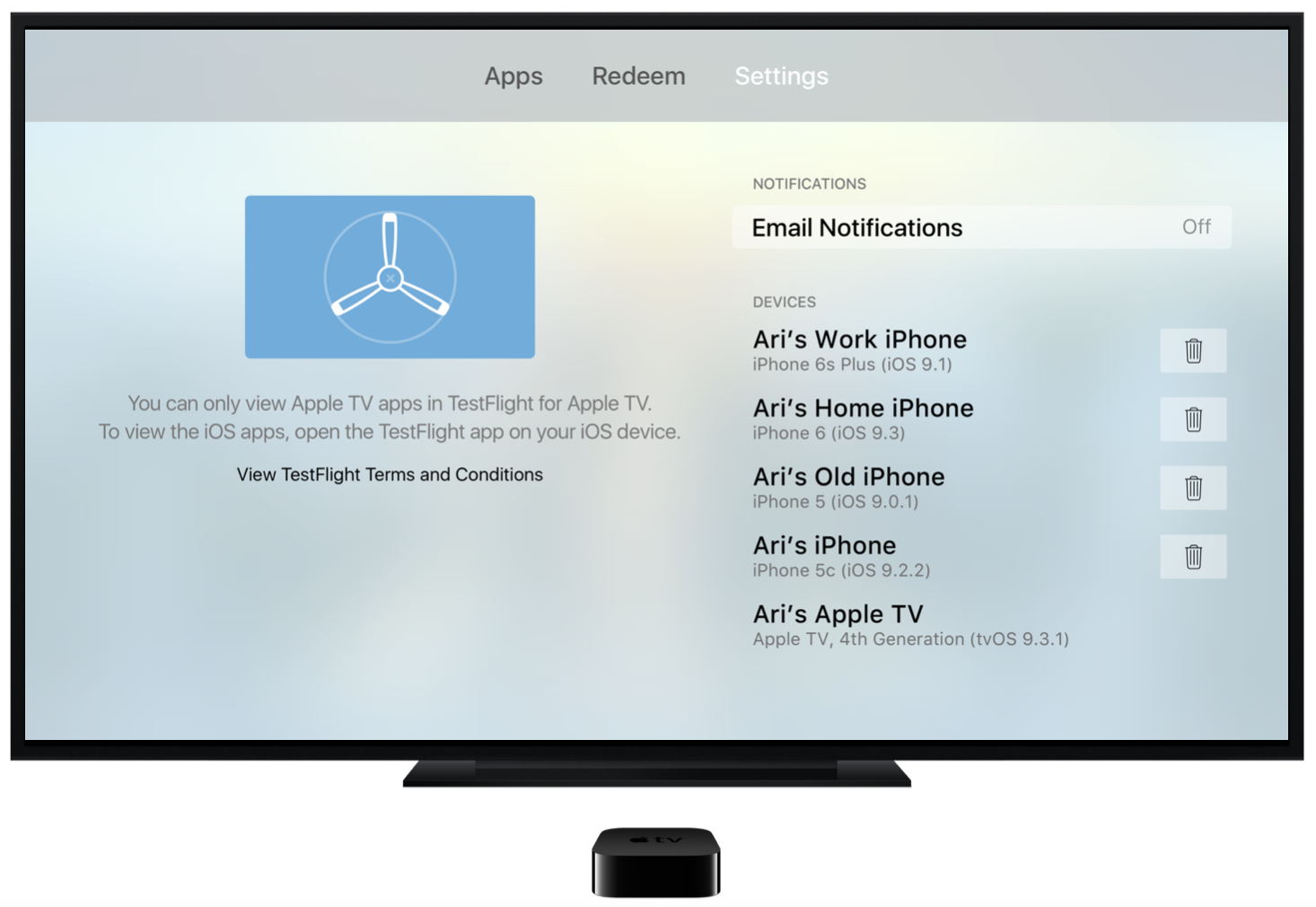
TestFlight on Apple TV only shows Apple TV apps. The settings note says it plainly, once. Repeating a caveat teaches people to skip it.
I wrote for a developer's precision and a first-timer's patience. When the two pulled apart, I sided with the newer reader.
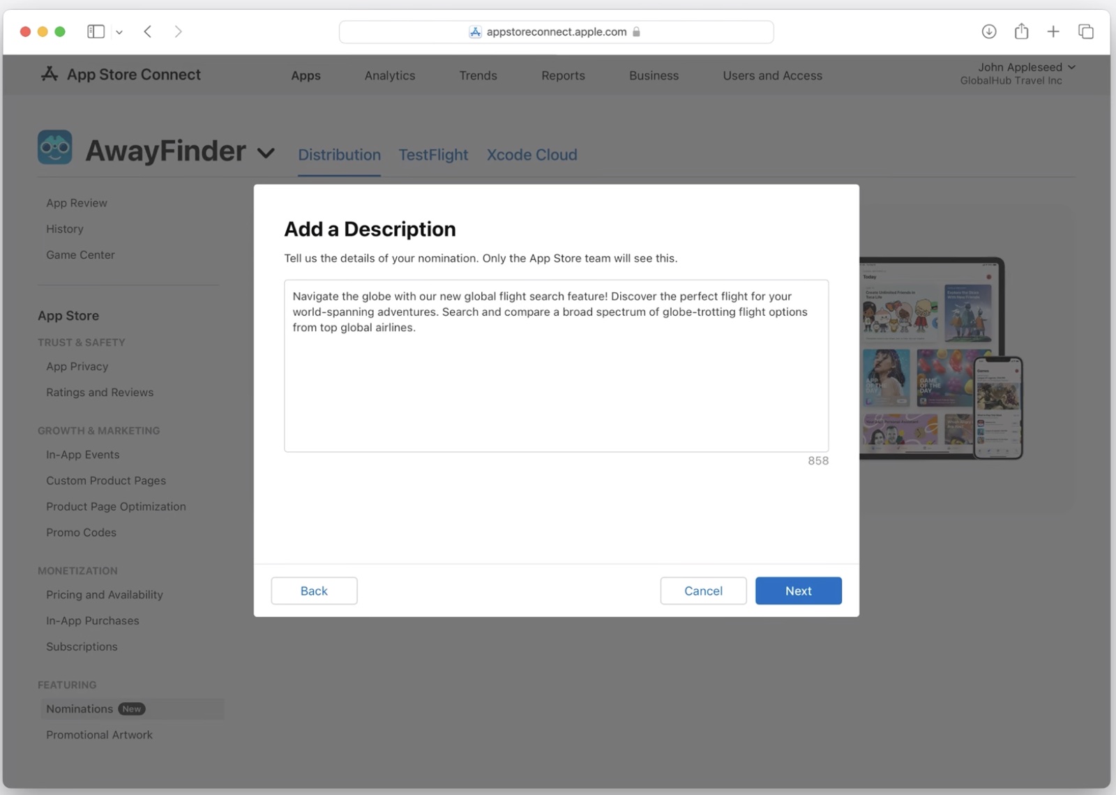
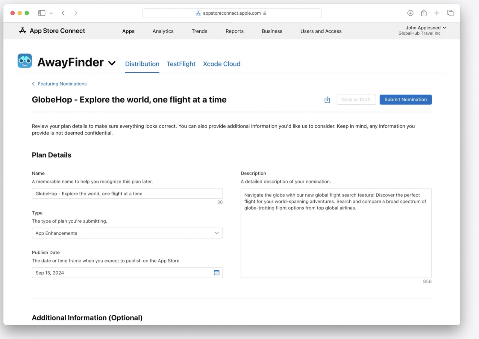
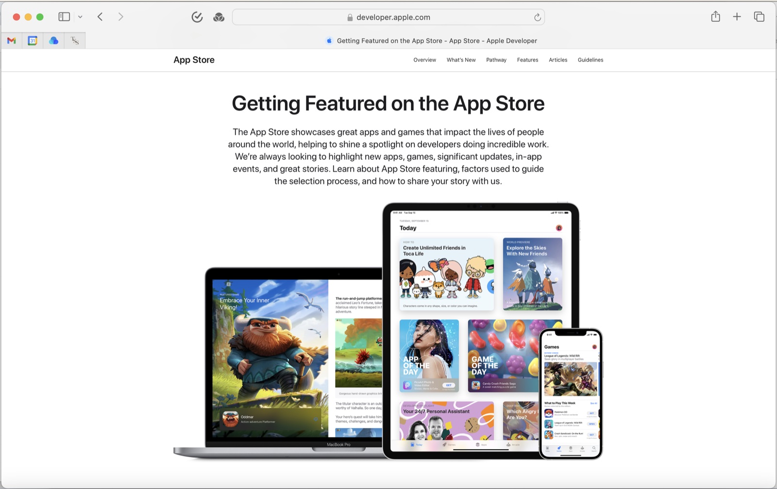
Getting featured on the App Store can change the trajectory of an app. Featuring Nominations gave developers a clearer way to share their work with Apple. I was the sole UX writer, shaping the name, the positioning, and the copy across the flow.
The interface asked developers for information, but the larger job was helping them understand the opportunity. What Apple was looking for, how to frame their work, and why submitting was worthwhile even without a guaranteed outcome.
Create a clearer path for developers to share their best work with Apple while staying careful about the promise. A nomination meant review, not a guarantee of featuring.

Featuring can give an app visibility most developers can't reach on their own, but the path to consideration wasn't always clear. Nominations gave developers a way to raise their hand.
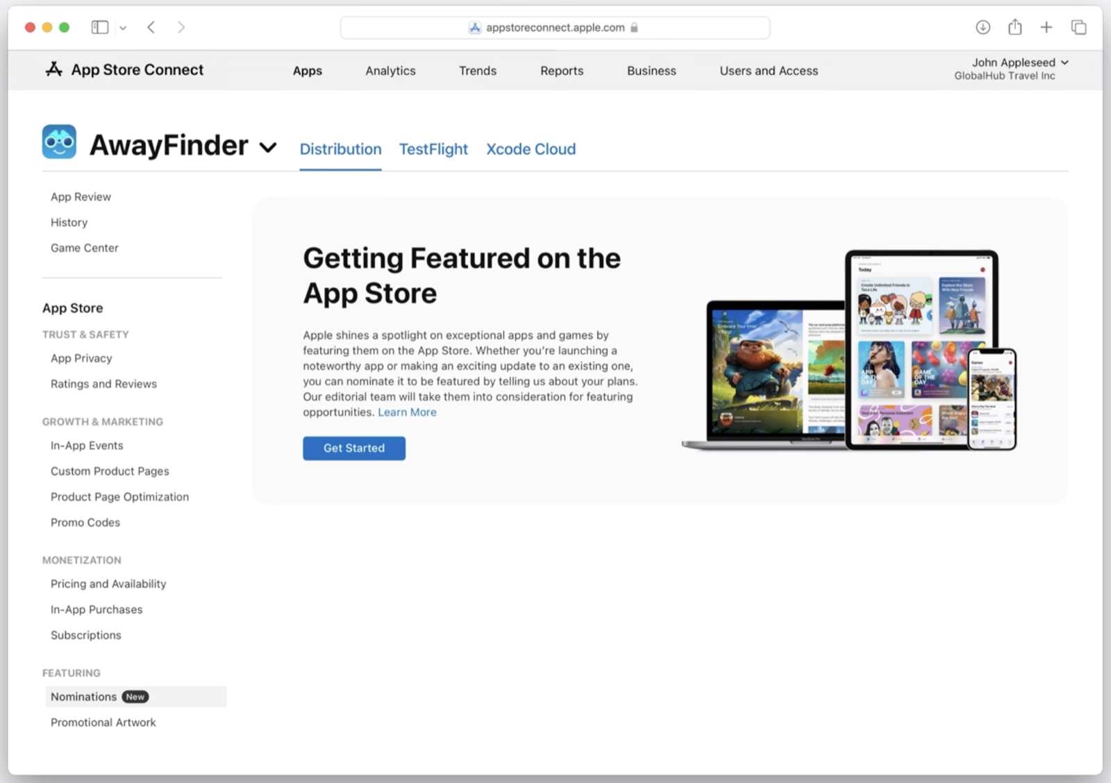
The sidebar tab initially said Featuring. Developers know what it means to be featured on the App Store, but Featuring as a label could confuse them. Is it a status, a request, a report? I worked with the team to change it to Nominations. It names the action a developer takes here, and it ties into the language on the intro screen.

Since the feature was new, the strategy was to give a brief overview of what featuring is, tie nominations to featuring, explain how the process works, and set expectations. One sentence for each job, then a single call to action.
Apple shines a spotlight on exceptional apps and games by featuring them on the App Store. Whether you're launching a noteworthy app or making an exciting update to an existing one, you can nominate it to be featured by telling us about your plans. Our editorial team will take them into consideration for featuring opportunities.

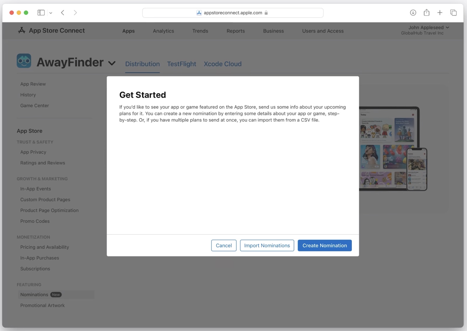
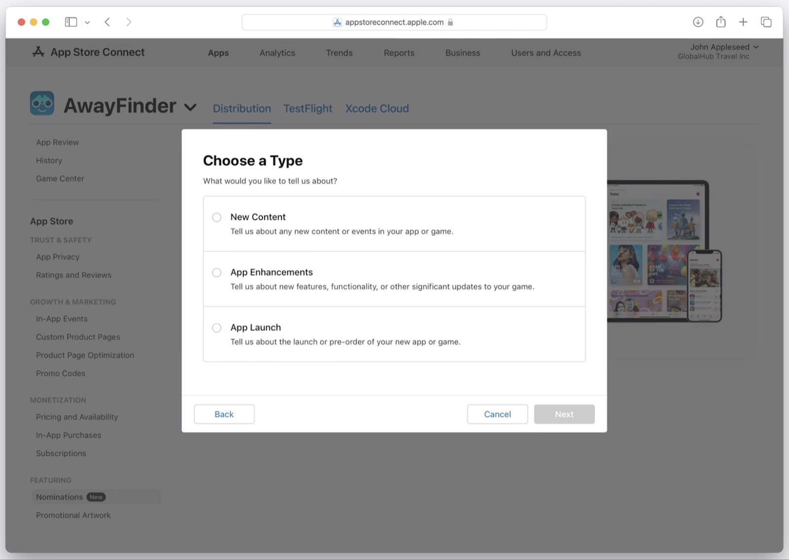
The first step had to move quickly. What this is, what you can submit, why it's worth your time. Too much excitement would overpromise. Too much process would shrink the moment. The copy stayed direct, practical, and encouraging.


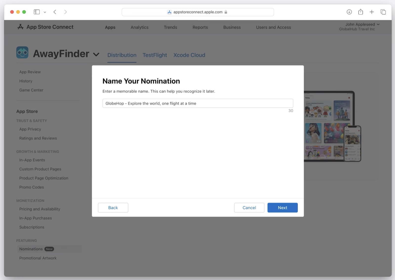
Explaining why your app deserves featuring is hard to answer cold. The copy made the blank fields feel less blank while leaving developers room to tell the story in their own words.


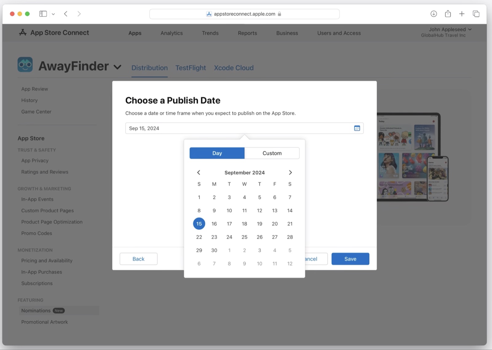
The trust lived in the details. Field labels, helper text, date guidance, confirmation language. It mattered most in the places people were most likely to hesitate.

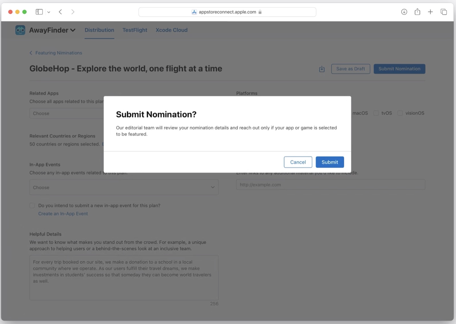
Submitting had to feel complete and worthwhile without feeling like a promise. Apple would review and decide. Encouraging, but precise.

Developers got a clearer way to share meaningful work. Apple got a structured way to see what was coming. For smaller teams without built-in visibility, that mattered.

The same positioning carried through developer-facing content explaining how featuring works and what makes a strong nomination. Helpful, clear, and careful about the promise.
Created a name that invited developers to take action without implying they would be selected.
Framed a new developer-facing feature as useful, credible, and worth engaging with.
Helped developers understand what to submit, how to describe it, and what information would make their nomination stronger.
Set expectations clearly so the experience felt encouraging without creating a false promise.
The best product copy solves the story first. The interface gets easier after that.
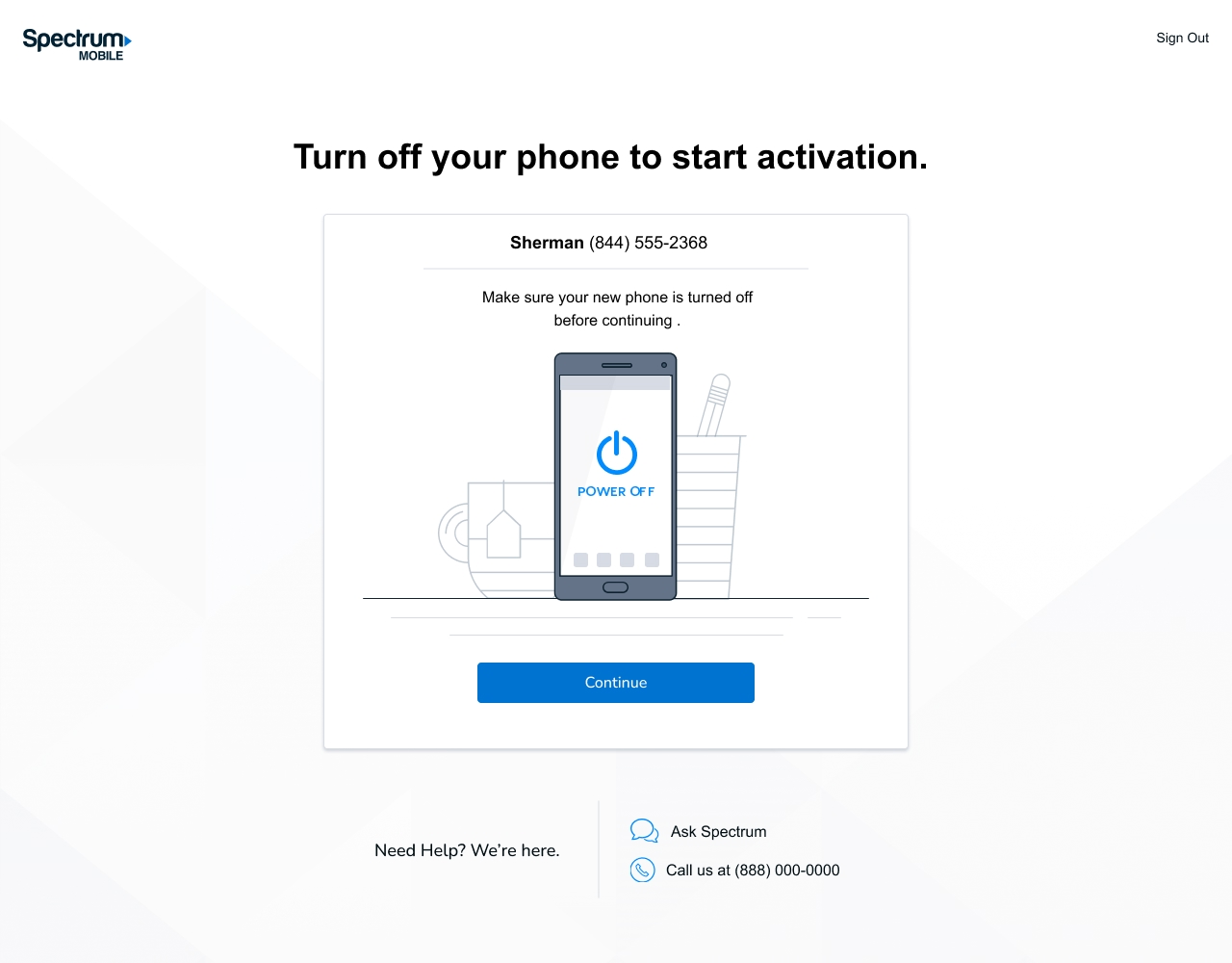
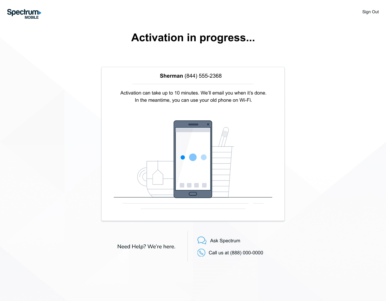
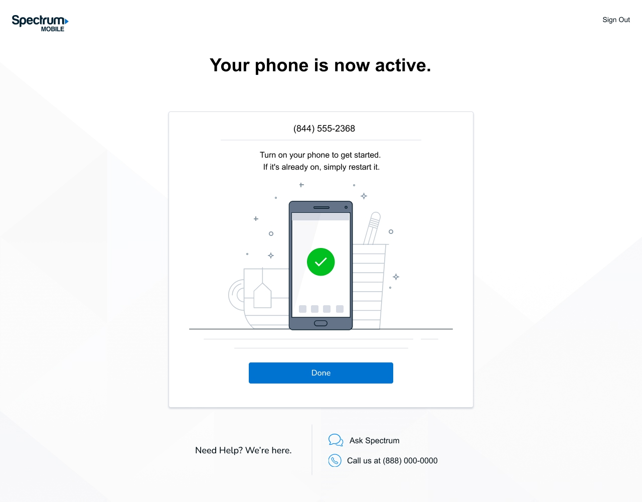
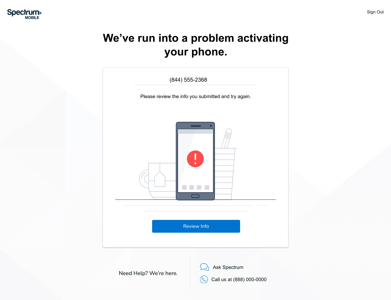
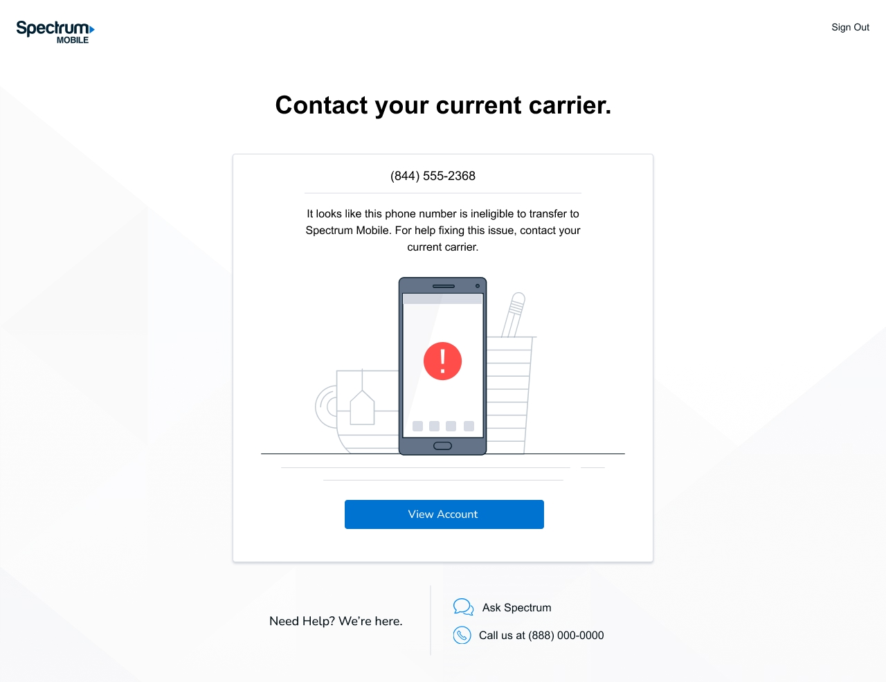
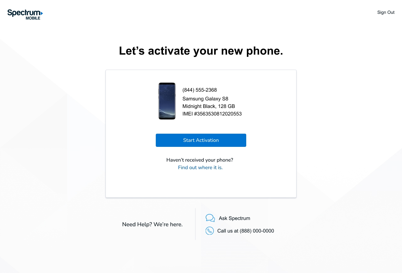
Spectrum Mobile lets people activate a new phone on their own, without a store visit or a call. I wrote the copy across the activation flow, from confirming the device to the success screen and the moments where something goes wrong.


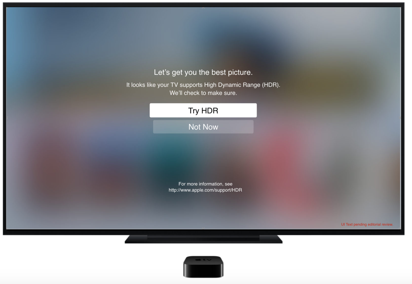
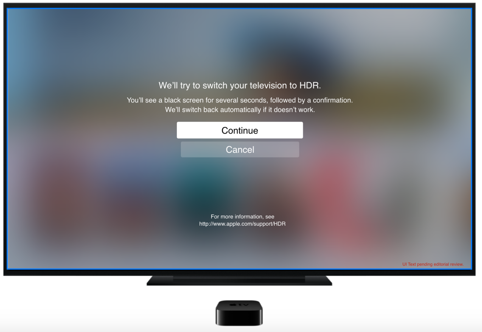
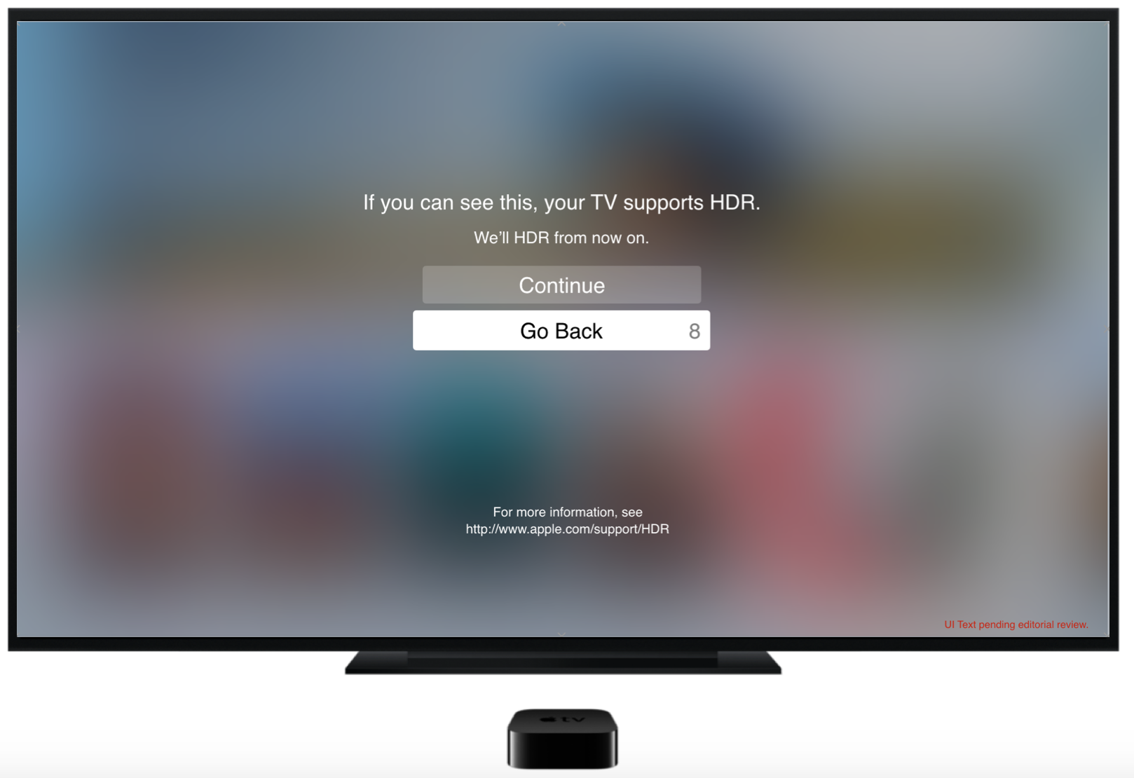
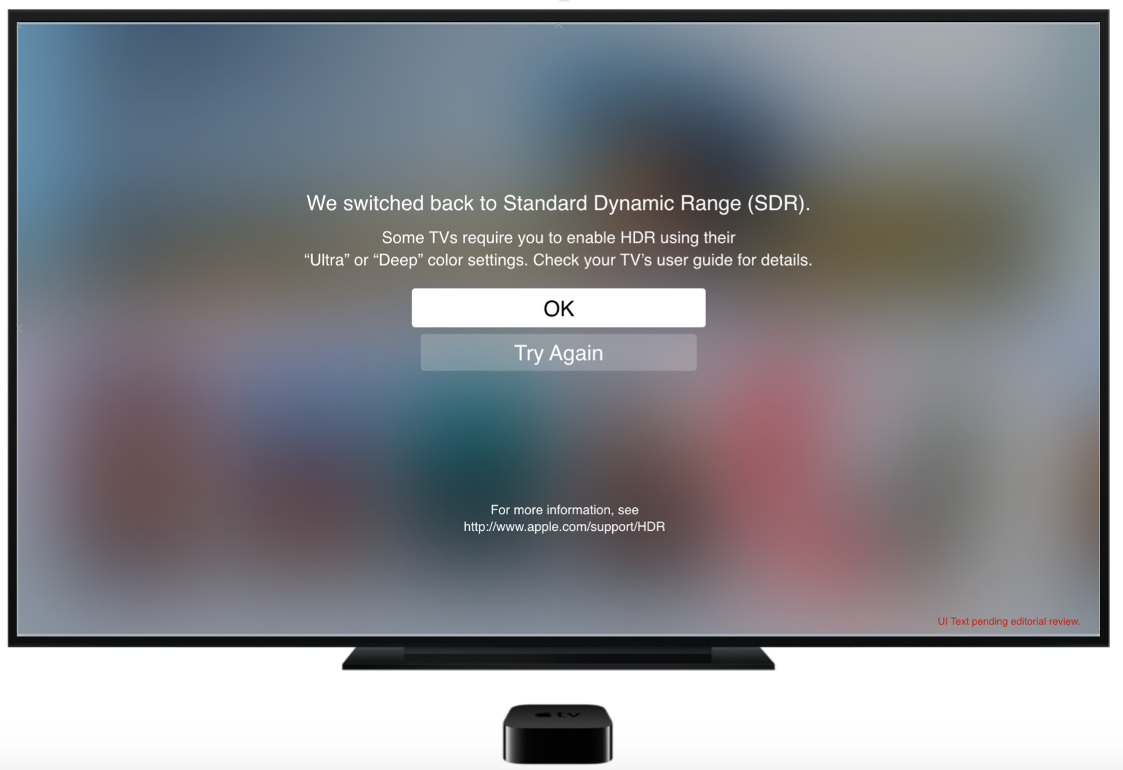
This feature on Apple TV lets users check whether their TV and HDMI cable support formats like Dolby Vision and HDR. These wires show proposed copy for the HDR flow.


Hey, I'm Lisa. I decide what the button says, and why it says that instead of the forty other things it could.
I've been doing that for ten years now, at Apple, Google, and Dell. The portfolio has the details if you want them.
I have a soft spot for the unglamorous parts of this craft. Error states, empty states, the settings screen nobody wants to design. Those are the moments where a product either respects someone or wastes their time, and the difference is usually one sentence.
Lately I've gotten a little obsessed with a harder version of the question. Not what the button says, but how you tell a language model what the button should say, and when it's allowed to break the rule you just gave it. Voice rules hold up fine until the stakes move. A playful empty state is charming. That same playfulness on someone's failed payment is a support ticket. Most style guides can't tell those two apart, so I've been building ones that can. Rules with consequences attached, written to be executed instead of interpreted.
When I'm not writing interface copy I'm in Portland, Oregon, usually with a fishing rod, a crochet hook, or one of my dogs. Sometimes all three, which goes about how you'd expect.
Reach me at lisa.collins78@gmail.com, or find me on LinkedIn